DOU
Design System & Identity Automation for Ukraine’s Largest IT Community
dou.ua
↗
System Design & Automation
I developed a modular visual identity system and an automated design workflow for each of the DOU community sections—enabling editors to independently create consistent, branded visuals for articles, blogs, events, and more.
Covers
Each sub-community—such as Frontend, DevOps, AI, QA, Product, Marketing, Design, Gamedev—received its own distinct visual style while staying unified under the DOU umbrella. The identities differ in tone, shape language, and accent colours to reflect the character of each domain, while using shared layout principles to maintain cross-platform cohesion.
To support scalability, I built a Figma-based template system with:
- Predefined styles, variants, and components for each community
- Responsive layouts that adapt to different content types
- Semi-automated cover generation for news, blog posts, interviews, and community updates
The system empowers non-designers—such as editors and contributors—to create clean, on-brand visuals quickly and independently, reducing production time while increasing visual consistency across the platform.
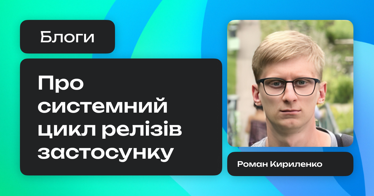
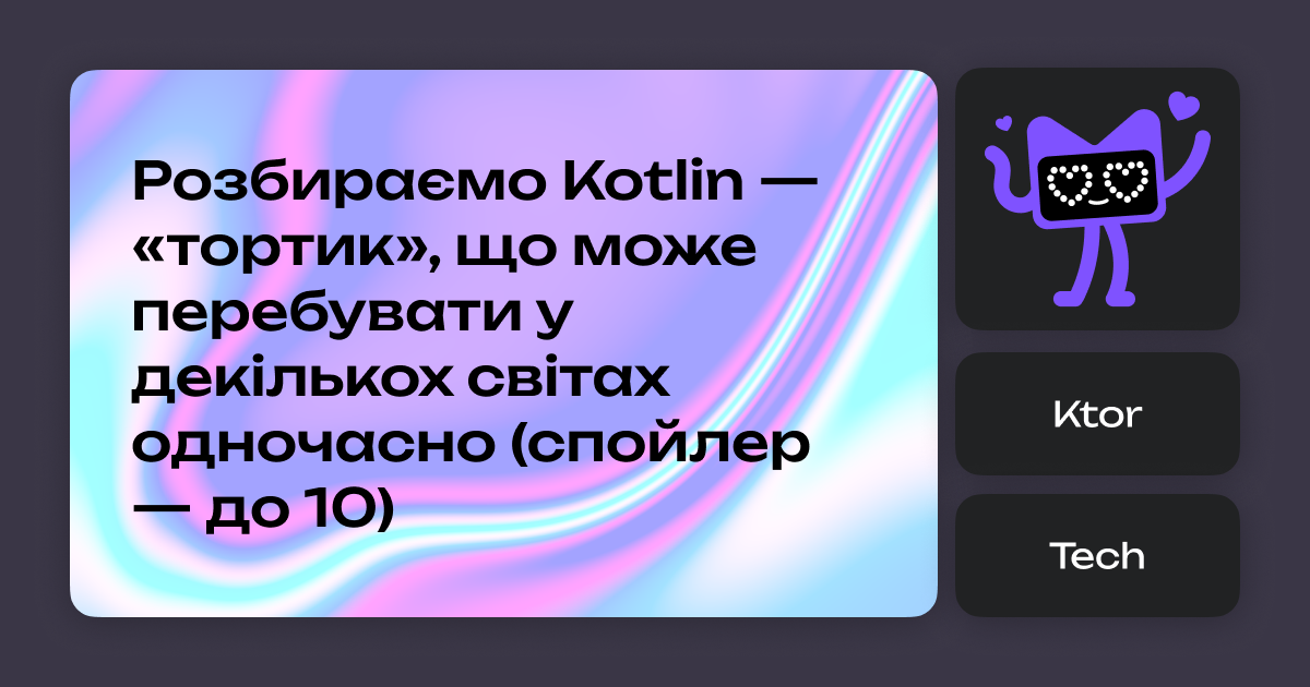
Frontend
A playful, modular identity inspired by the “sweets covers” principle: vibrant layouts composed of interchangeable UI-like blocks, echoing the front-end development mindset.


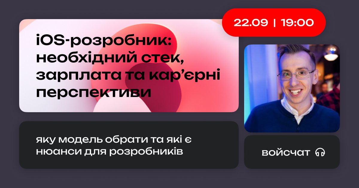
Mobile
Inspired by the bento grid concept: compact, clean, and responsive modular blocks, echoing mobile UI/UX patterns.

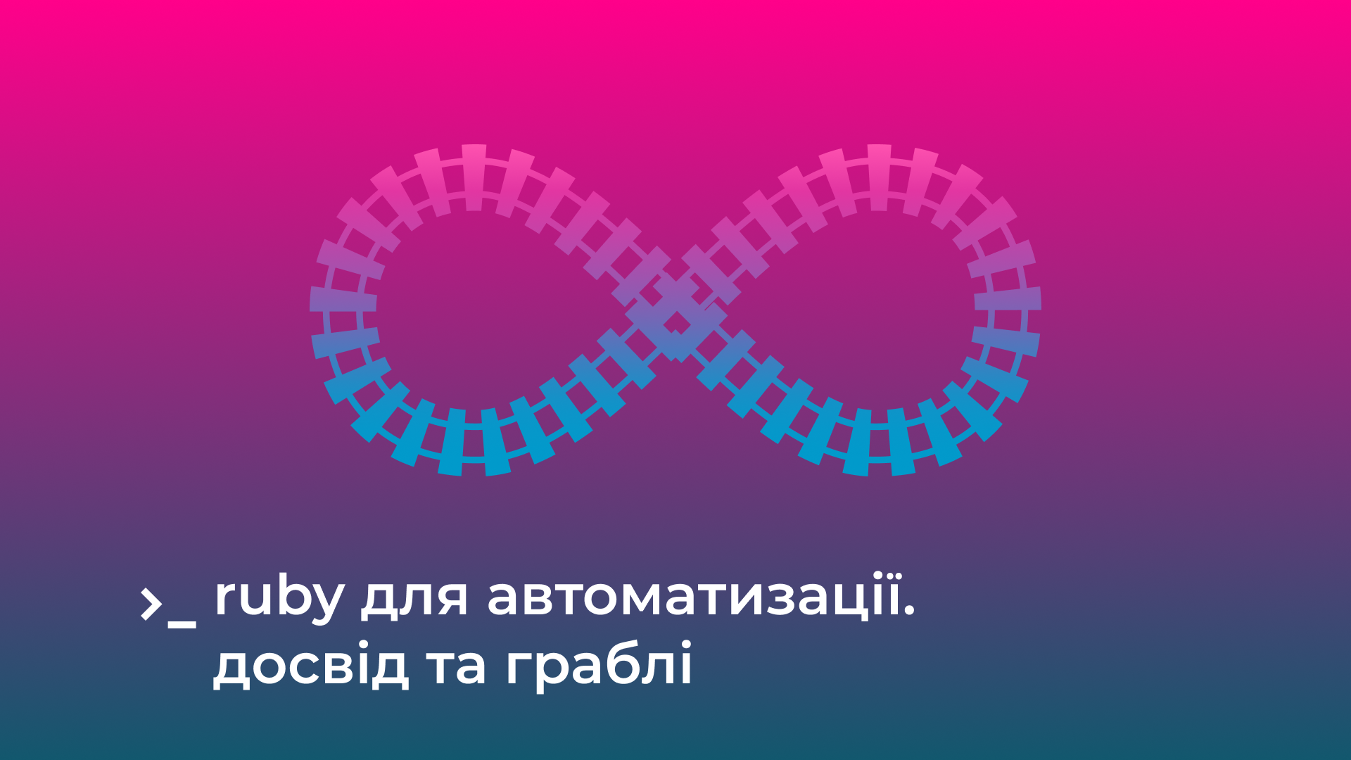
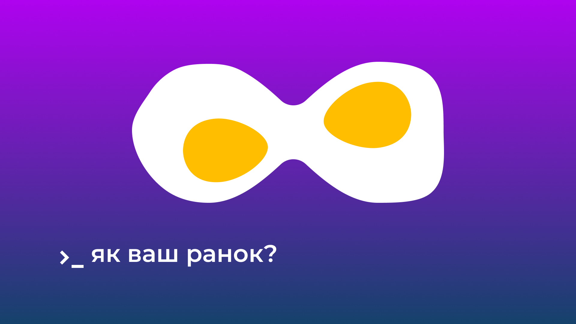
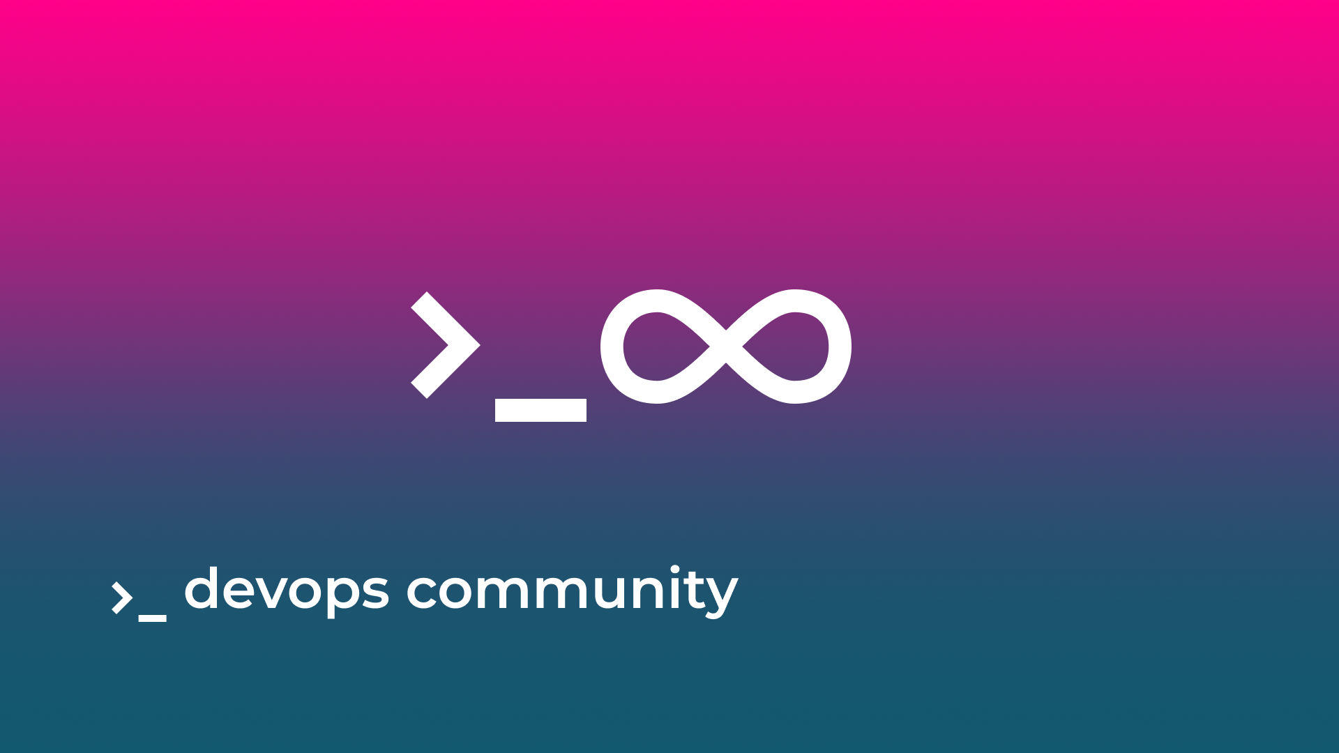
DevOps
Built around the infinity symbol, symbolising continuous delivery and process flow. It adapts contextually — for example, formed from railway tracks when discussing infrastructure topics like Ruby deployment.


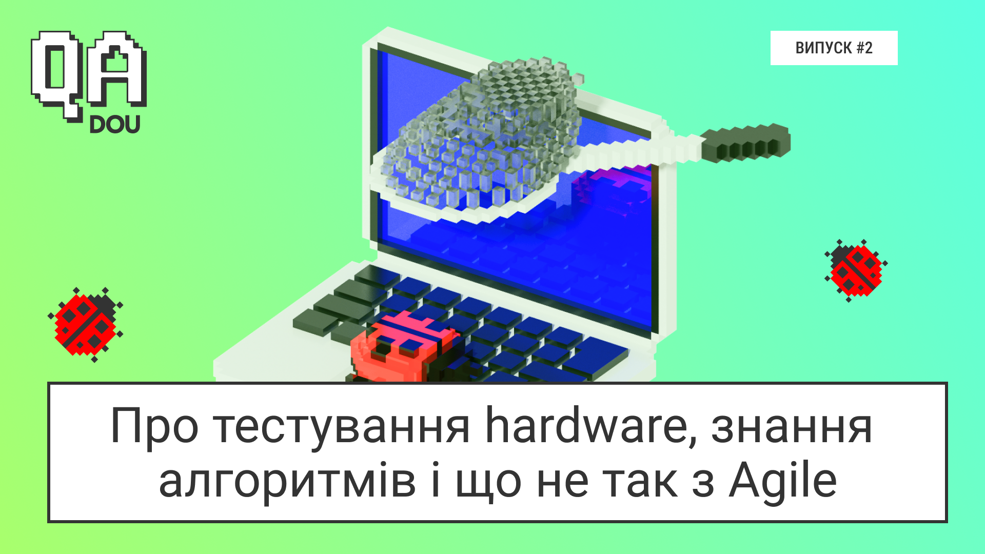
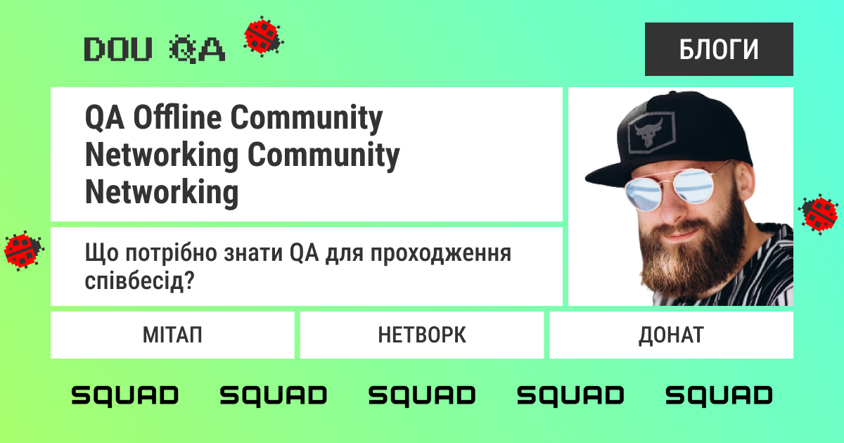
QA
A strict, grid-heavy system using complex block compositions that reflect structure, testing layers, and methodical validation.